How do analytics work in the XemailCampaign dashboard?
Overview
The XemailCampaign dashboard gives you a complete view of campaign activity, deliverability, engagement, and reply performance in one place. It is designed to help you quickly understand how your outreach is performing and where you need to take action.
The dashboard includes campaign-level metrics, deliverability trends, inbox placement visibility, and recent reply activity. Reviewing these analytics regularly helps you identify issues early, improve performance, and make better decisions about your campaigns.
How do date filters work?
- Last 7 days
- Last 30 days
- Last 90 days
- Custom range
These filters update all analytics on the dashboard at the same time. This allows you to compare short-term performance with long-term trends. Shorter ranges are useful for monitoring active campaigns, while longer ranges help you evaluate broader performance patterns.
 KPI Analytical Bar
What does Total Campaigns mean?
The Total Campaigns card shows the total number of campaigns created during the selected date range. This metric helps you understand how many campaigns are currently running, paused, completed, or created recently.
If the number is increasing over time, it usually means you are expanding your outreach. If it decreases, it may indicate that campaigns are being completed or paused. The percentage below this metric compares your campaign volume with the previous reporting period.
What does Active Campaigns mean?
The Active Campaigns card shows how many campaigns you have started in this week . This is useful for understanding how much outreach is actively happening at a given moment.
Reviewing this metric regularly helps ensure campaigns are actually running as expected.
What does Emails Sent mean?
The Emails Sent metric shows the total number of emails delivered across all campaigns during the selected period. This includes emails sent through all active sender accounts and sequences.
Monitoring this number helps you understand:
- Overall sending activity
- Whether campaigns are scaling properly
- If sending volume has dropped unexpectedly
A sudden decrease in emails sent can indicate paused campaigns, sender issues, or exhausted lead lists.
What does Open Rate mean?
Open Rate measures the percentage of emails that were opened by recipients.
This is one of the strongest indicators of:
- Subject line quality
- Inbox placement
- Domain reputation
- Lead relevance
A healthy open rate usually means your emails are reaching the inbox and your subject lines are generating interest.
If your open rate is low, possible causes include:
- Poor subject lines
- Spam folder placement
- Weak sender reputation
- Unqualified lead lists
Open rate should not be viewed alone. It is most useful when compared with reply rate and deliverability trends.
What does Reply Rate mean?
Reply Rate shows the percentage of recipients who responded to your emails.
This metric helps you understand whether your campaign messaging is actually generating conversations.
A strong reply rate usually means:
- Your offer is relevant
- Your messaging is clear
- Your targeting is accurate
- Your campaign is reaching the right people
If your open rate is high but your reply rate is low, it often means people are seeing your emails but not finding the content compelling enough to respond.
In that case, you may need to improve:
- Personalization
- Value proposition
- CTA clarity
- Sequence timing
What does Inbox vs Spam show?
The Inbox vs Spam section gives you a breakdown of where your emails are landing.
This helps you understand whether your campaigns are reaching the inbox or being filtered into spam folders. A healthy campaign should maintain strong inbox placement over time. If spam placement starts increasing, it may indicate:
- Poor domain reputation
- High bounce rates
- Low engagement
- Spam-triggering content
- Authentication issues with SPF, DKIM, or DMARC
This section is one of the most important deliverability indicators in the dashboard.
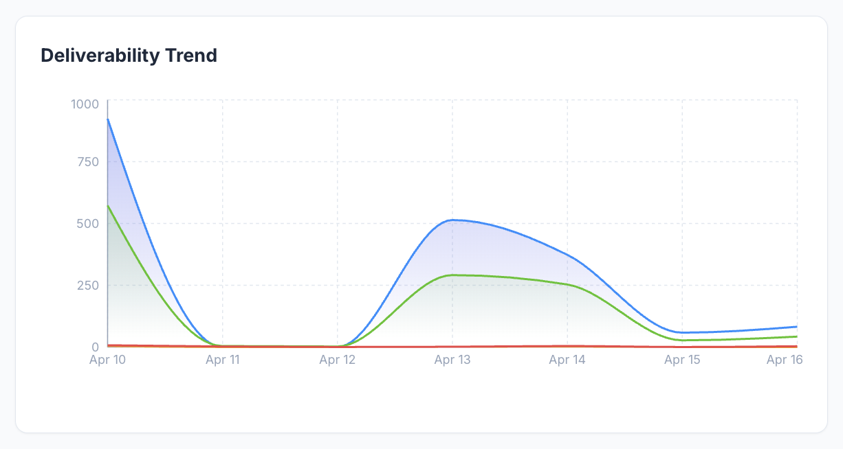 Deliverability TrendWhat does Deliverability Trend mean?
The Deliverability Trend chart tracks how your sending activity changes over time. This graph usually compares:
- Sent emails
- Inbox placement
- Spam placement
By reviewing this trend, you can identify:
- Days with unusually high or low sending
- Sudden drops in inbox placement
- Increases in spam placement
- Performance changes after launching new campaigns
Deliverability trends are especially useful for spotting issues before they become major problems. For example, if sent volume stays high but inbox placement drops, it may be a sign that sender reputation is weakening.
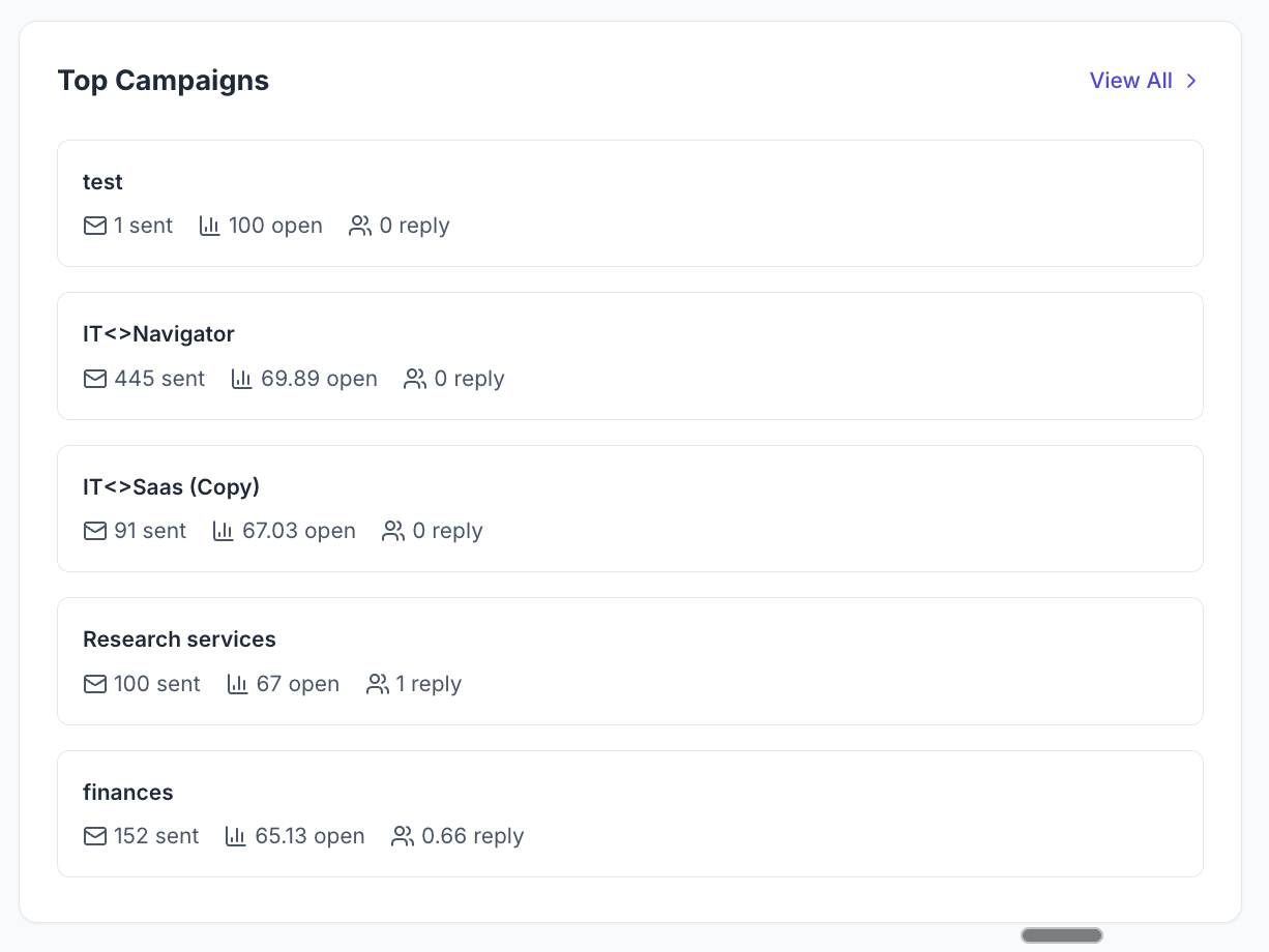 Top Campaigns
What does Top Campaigns show?
The Top Campaigns section highlights the recent campaigns based on sending activity and engagement. For each campaign, you can usually see:
- Emails sent
- Open performance
- Reply performance
This section helps you quickly identify which campaigns are performing well and which ones may need optimization. You can use these insights to:
- Reuse successful messaging
- Improve weaker campaigns
- Compare subject lines and offers
- Understand which audiences respond best
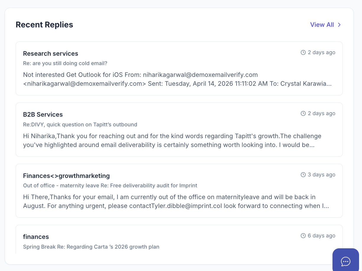 Recent Replies
What does Recent Replies show?
The Recent Replies section displays the latest responses received from leads. This allows you to quickly monitor:
- New conversations
- Interested prospects
- Objections or questions
- Follow-up opportunities
Reviewing replies regularly helps you move leads through the sales process faster and prevents important responses from being missed. You can also use recent replies to understand what messaging is resonating most with your audience.
How should you use dashboard analytics effectively?
The dashboard is most useful when reviewed consistently rather than occasionally. A strong workflow is to:
- Check sending volume daily
- Monitor open and reply rates weekly
- Review inbox placement trends regularly
- Watch for paused campaigns or bounce issues
- Compare campaign performance over different time ranges
Looking at multiple metrics together gives you a more accurate understanding of campaign performance than relying on a single number. For example:
- High open rate + low reply rate = weak messaging
- High send volume + low inbox placement = deliverability issue
- Strong replies + low sending volume = opportunity to scale
